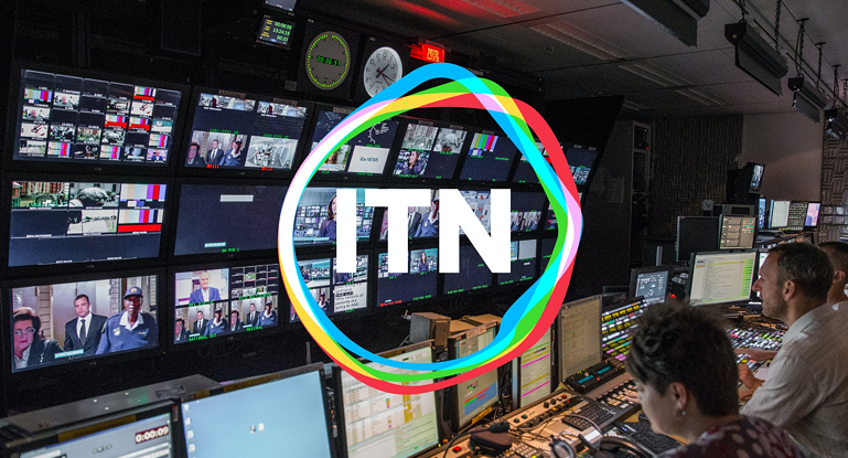
At the end of November, ITN launched new branding and a new animating logo for the company.
In a press release, it said that the ITN rebrand reflects evolution from what it called “a legacy British news organisation” to a “global production power house”.
The new brand and visual identity replace ITN’s static logo with a new animated logo, “which responds to its environment, reinforcing ITN’s reputation for innovation, its ability to reflect changing audience needs and its more varied portfolio”.
The press release explained that ITN’s business is now made up of seven distinct divisions – Business, Education, Newsrooms (ITV News, Channel 4 News and 5 News), News Production, Post Production, Productions, and Sport.
The old ITN logo has been in place since 1970 and seen only minor changes, making it one of the longest standing logos in UK broadcasting. ITN’s new brand identity is built around a new strapline – “Truth to Life”.
ITN CEO Rachel Corp said: “Our challenge was to pay homage to our powerful legacy as a trusted, impartial news provider, at the same time as re-articulating who we are and what we stand for today. We homed in on how we are a purpose-driven organisation with a mission to bring ‘truth to life’ and put peo ple at the heart of everything we do.
“This resonates across all parts of ITN and creates a distinctive and future-facing business proposition.”
The creative director on the project, Matthew Rudd, said: “We decided to build the new logo around the original, simple ITN letterforms to signal a continued dedication to accuracy and impartiality. But this time we set free the rigid, angular line around the letters so that it can move and respond to stimulus like a living cell.“

